Where we started
The product had several benefits, ingredients and energetic messages competing for attention on a small screen. We began by defining what a new visitor needed first and what objection had to be answered before asking for an order.
What we built
- A benefit-led opening rather than an ingredient dump.
- Clear calls to action at natural decision points.
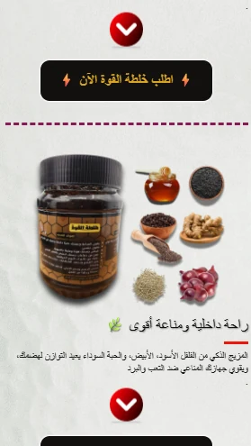
- A visual product-and-ingredient section.
- Room for video, evidence, questions and ordering details.
Commercial logic
A clearer journey does not guarantee a sale. It makes the offer understandable and creates measurable transition points for later testing.
Evidence note: this story describes the problem, reasoning and visible interface outputs. It makes no revenue, conversion or financial claim because verified performance data was not supplied.